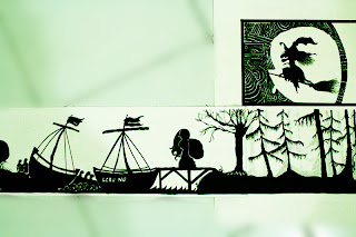
The principles of design suggest how a designer can best arrange the various elements of a page layout in connection to overall design and to each other.
Paper cut-out
The goal of visual design is to communication. How you organize and prioritize your elements conveys valuable information about their relative importance.So you will get to know what is the story behind the graphic.
Symmetrical balance
Symmetrical balance is seen in a perfectly centered compositions or those with the mirror image.This image is called reflection of water waves.I used all the curve shape to create as strong waves.
Asymmetrical balance
asymmetrical balance. 1
Asymmetrical produces an informal balance that is attention attracting and dynamic.I folded the paper and cut out a flower shape.This was the result that i got. Flower is the main point of this picture. I put some effort at the center to look up protrude ,so it become 3D effect.
ps:We can create a 3d form within the paper also.
Asymmetrical balance. 2
I created a triangle by using the opposite line to represent out. This principle is called as asymmetrical balance.
Repitition
I using squares to create a repetition.
From the square I created a girl who r seen mysterious. Like thinking something or just act flatters mutually.
Rhythm
Rhythm defined as a "movement marked by the regulated succession of strong and weak elements, or of opposite or different conditions.".From the picture,it will lead audience view from the smaller part to the bigger part. (from upward to downward) Because it contains a strong and weak elements .Example, size of triangle.
Scale
Scale is the ratio between the size of something and a representation of it.
Arghhhh! It become smaller and smaller, no space for me to extend my body. :(
Movement is an optical illusion of motion produced by viewing a rapid succession of still pictures of a moving object. I used leaves to make the movement and wind to act as a staring point. Do you see the leaves flow from downward to upward tree??
Dominance
Dominance is an object that stands out in relation to the picture.So what you first noticed in the image?
Am i guess rite? ya, is FID. This show that we are proud to be a FID students. Hope we together can be a outstanding designers. (just same as this sun in this picture, illuminate the darkness.)
Hierarchy
Hierarchy is naturally enough creating this organization and prioritization visually. It aids comprehension, reinforces your message, and guides your visitor through your story. So from this picture it tell you the more effort you put the more things you will gain.
Even though you suffered sometimes , but when you achieved, u will know that all your toilsome was worthy then that is enough.
-DONE-


